
Here's a list of some of the websites that really stuck out to me:
*Glitter & Rye- http://www.glitterandrye.com/
*The Girls with Glasses Show- http://thegirlswithglassesshow.blogspot.com/ (not so much their website, because it's just a simple blog, but I LOVE their videos and their style and just everything about those two women. they inspire me greatly.)
*The Stylish Bride- http://thestylishbride.com/ (i love the watercolor drawings)
*ban.do accessories- http://www.shopbando.com/ (love the background color and glittery accessories. an outfit is not complete without something shiny)
Then I thought about some adjectives that I think describe my photo style and my business and me, with some help of my mom.
*colorful *bright *artful *fun *modern *handmade *eclectic *personal *quirky *genuine
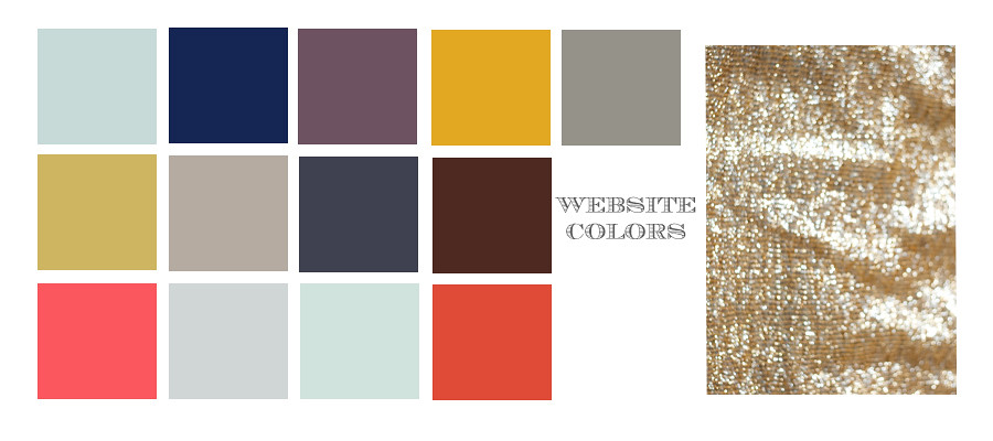
Then I thought of colors that I liked. I found photos through out the internet that drew me in because of the colors and I pulled out the colors in photoshop to create a little color inspiration board.
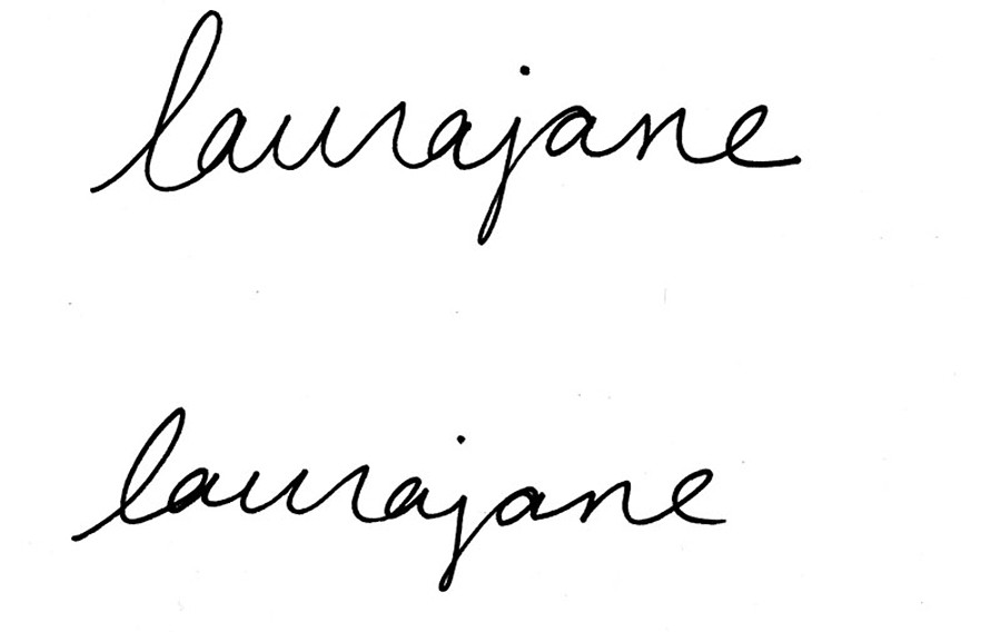
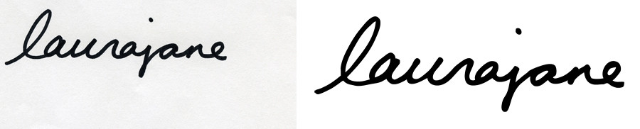
I really loved the signature logo that I've been using since the beginning of my business. It's the only thing that I seem to be able to keep consistent. It's the one thing that's truely "me". But the original just wasn't working for me anymore, mainly because I had no idea how to get rid of the white background from it so I couldn't put the signature anything that wasn't white. So I had my friend Steph, who's a graphic designer, help me out when I was at her house for the photo workshop in Nashville. I rewrote the signature and she put it through Illustrator and now it looks all clean and professional. Here's Steph's website to check out her awesome work. She makes these really cool collages. http://www.whereisstephnow.com/
The very first signature drawings.
The new one, and the clean Illustrator version. It's amazing how much better a few simple little changes make in making it look more professional.
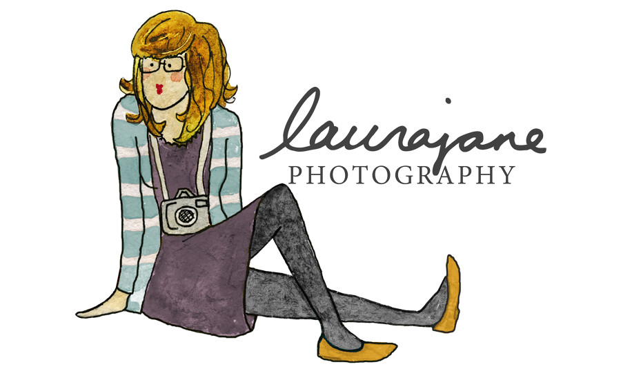
Then I knew that I really wanted a watercolor drawing of me. And I knew just the person to do it. My friend Liz draws these adorable people, so I asked her if she'd draw a few of me. And I seriously love them. Check out her website to see more of her work: http://lizmannchen.carbonmade.com/
I was pretty surprised how much they really looked like me.

Then Steph helped me scan in the images and cut out the white background. She also showed me how to change the outfit colors. As much as I loved the original colors that Liz used, they didn't quite fit with the color scheme I was going for or the colors that seem to show up so often in almost all of my photos. So after a lot of color changes, I finally settled on the blue, purple, and yellow combination.
Next, it was time to recreate my website. I've always wanted a Showit site, but just like there was no room in the budget for a graphic designer, there was no room in the budget for that website either. In the future that will be happening. But for now I just worked my virb site, and it was actually a little easier than I thought it was going to be (HOORAY). The url will be changing for that site in the near future as well, as soon as I figure out how to do that. I already purchased a url so start memorizing www.laurajanephoto.com as my new address. I'll let you know when it changes.
As much as I love colors and shiny things, I also really love white space and clean lines, so that was the inspiration for my main website. Here are some elements from that. You can view the whole thing at http://laurajanephotography.virb.com/ for now.
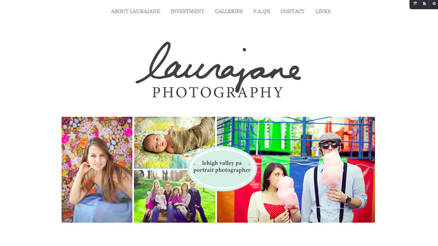
The HOME page.
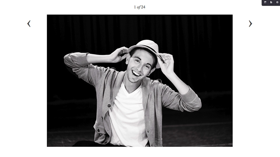
The GALLERY page.
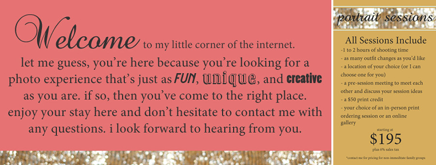
My information boxes are different colors with a strip of glitter, which is a photo that I took of that gold glittery skirt that I wore a few outfit posts ago.
Wow that was a long post. I hope you're not too exhausted after reading all of that. And I hope that you enjoy all of my little branding changes. I think this one might stick around for awhile.
No comments:
Post a Comment